Aviso Wealth & Client Builder
Prompting Investors to Provide Bank Info
Background
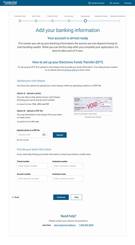
Created a new design for investors to add their bank void check by themselves. Streamlined the process to reduce manual process for financial advisors.
Timeline
4 months
Role
End to end product design
Stakeholders
2 product managers, 1 business analyst, marketing team, compliance team, 3 engineers, 4 developers, 1 UX researcher, and 1 UX writer
Tools
Figma, Miro, Dovetail, WorkFront

Discovering Business and User needs

Current User Flow
Send an investment onboarding application link to investor's email
Receive the link in email
Proceeding questionnaire in the application
🤔 Investors might feel hesitant to upload their bank information.
Submit the application online
Receive and review the application
🤔 Difficult to edit or fix any errors that occur within the application after the submission.
The Challenge
-
How can we prompt investors to upload their bank info on their own?
-
How can we reduce minor errors and manual process for advisors?
Goals for tool
Usability
The user needs to feel comfortable uploading their bank information without meeting with their advisors.
Business
Provide new page to streamline the onboarding process for the investors. Reducing minor errors after submitting application to prevent extra cost.
User surveys
With a survey from the similar onboarding application results and conducted user interviews with the current financial advisors.
Survey findings
Discovered that 11% of drop off rate. Also, 77% of users decided to fund their account after the meeting with the financial advisors.
The investors value a sense of accomplishment by submitting thier application.
Competitive Analysis
Identify market opportunity
Goals
Find what our competitive writing landscape looked like. Understand what product features we needed in order to compare with our competitors.
Results
Findings were Wealth Simple offers the clear instruction where I was not distracted other design elements. Some graphics would help for the intuitive process.
.png)
Brainstorms and User Journeys
_edited.jpg)


Interviewed investment advisors and investors
Goals
Observed the user interview with the advisors and investors and gathered feedback about what are their frustrations in their onboarding process.
Results
I was able to learn that both investors and advisors struggle to proceed the bank information page. There was more error for this page on advisors side. I quickly realized that wording part for this page was essential.
User journey map
Goals
With the gathered information from surveys and interviews I wanted to create a journey map based on how investors and advisors were thinking, feeling, and experiencing onboarding application.
Results
I noticed through some interactions and interviews with advisors that even after the meeting, there were 232 void check denials. Investors are struggling to proceed the page although they'd need to upload their bank info in order to fund their account.


Wireframe prototypes
Goals
To accelerate our team's progress toward showcasing functionality, features, content, and user flows as planned, I developed basic wireframes emphasizing speed over detail.
Results
These sketches underwent extensive discussion with the engineering team, allowing us to address trade-offs and identify issues before proceeding to layout testing.
Design Hurdle 1
Design description
Challenge: How to avoid users feel overwhelmed?
After sketching out a variety of options I wanted to create high fidelity prototypes.The description part is one of the main design element to be considered.
I worked with a UX writer closely to determine how the description sounds less intermediating. Discussed with the whole team in the regular meeting to receive feedback.
Solution: Use the optimal approach
I performed qualitative research to explore similar platforms used in onboarding processes. Following the research, the UX writer recommended adopting the style found on government websites. While it's a common approach, its familiar tone could be suitable for an investment onboarding platform.
Design exploration


User Research
Type of research
To comprehend which user experience is right for the user I built the user task flow and interact with the team. We discussed thoroughly and made note of their interactions and iterated them for prototyping afterwards.
Findings from research
The discussion revealed that the initial suggested description was a little bit tricky since we understand that giving users a sense of accomplishment is crucial but they haven't created the account fully yet.
Impact of Research on Product Development
Our product was recognized as an innovative technology from Chief Information Officers Canada 2023.

"In this page, the user is not fully done yet."
Design Hurdle 2
Visual cues
Challenge: How to instruct users clearly?
After conducting the survey, we discovered 232 void check denial every month. One of the challenges was lack of graphic - it seems to be too wordy in the page.
Solution: Design Analysis and Design System
Adding more visual icons, images and cues to navigate users to upload their bank info. Following the existing design system to be consistent design throughout the page.
Design exploration


User Research
Type of research
To understand which sections needs to be emphasized in order for users to upload their bank information. Content inventory helped me gauge the thorough process.
Findings from research
Content inventory showed me that users would need extra navigation for a smooth uploading process.
Impact of Research on Product Development
This layout resulted in +10% user involvement in analyzing results.
Design Hurdle 3
Optional button
Challenge: How to create intuitive design?
We understood the sensitivity of this page for certain investors who personally upload their bank information. Consequently, extra measures were taken to ensure that this page is optional, respecting their discretion and choice in using it.
Solution: Place the button on the bottom
Placing the button at the bottom of the page enables users to easily review the content before deciding whether to upload the void check. This approach respects their choice by not forcing them to proceed, allowing for a more comfortable and non-obligatory user experience.
Design exploration


User Research
Type of research
Developing proto personas for user experience involves mapping the perspectives of investors and advisers, exploring their quadrants of pain points, needs, and goals. This approach helps understand their unique journeys, guiding the creation of tailored solutions.
Findings from research
Smooth user application processes significantly lessen the manual work for advisors in uploading investor bank info. Prioritizing wording and visual cues are crucial to achieving this efficiency.
Impact of Research on Product Development
Page engagement surged by over 20% following rapid usability testing, indicating increased user interaction and interest.

"Funding sounds terrifying"
Production
Final design

Normal

Selected

Error

Optional
Design System
Typography
Headline 1
H1 48/60px
Headline 2
H2 34/50px
Headline 3
H3 28/38px
Headline 4
H4 18/22px
Paragraph
P 14/24px
Buttons
Colour
Primary
#18619B
Secondary
#FFFFFF
Error
#FF4040
Accessibility for all
During this project, my priority was ensuring universal accessibility for the tool. I calculated color contrasts to maintain a 3:1 ratio and established a tab/focus order for developers to implement into the code.
Primary
Default
Secondary
Hover
Primary
Disabled
Results & Next Steps
Initial Results
Quotes from colleague
"Great job on thorough UX process"
"Built on a strong UX ownership"
Final thoughts
Next, I'll be using the heat maps to continue researching on improvements. Introducing a quick survey after the onboarding to understand user journey better.


