
Momentum Financial Services Group/ Money Mart
Revamping mobile app with a new design system
Background
Money Mart, a part of Momentum Financial Services Group (MFSG), now has a brand new app designed from scratch. I collaborated closely with Product, Marketing, and Compliance/Legal teams to bring it to life.
Timeline
8 months
Role
End to end product design
Stakeholders
A product owner, a chief of marketing, 6 developers, director of compliance, a legal team, and marketing managers.
Tools
Figma


Discovering Business and User needs
Old Money Mart app


The Challenge
-
How can we completely redesign our existing app?
-
What’s the best approach to building and implementing the Money Mart design system in our company?
Goals for tool
Usability
We faced a high drop off rate during loan applications, as users felt confused and uncertain. Previously, the lengthy process required answering numerous questions, taking about 30 minutes to receive a pre-qualification result. This long journey became a major bottleneck before we introduced a shortened loan process.
Business
Our goal is to maintain 18,000 applicants per day while ensuring they can successfully complete the loan application. The design not only streamlines the flow but also emphasizes clear and accurate information for a smoother user experience.
User survey's
Conducted UX research with the Google Analytics GA 4E.
Survey findings
We offer both Installment Loans and Single Payment Loans. Out of 22,265 initial applications, only 471 result in final offers, indicating a significant drop off in the process.
Brainstorms and User Journeys

Competitive Analysis
Goals
We aim to make our app more streamlined and deliver a fresh, modern look to our users. To achieve this, I've started documenting how our competitors operate.
Results
I found iCash targets a younger audience with a playful, soft design featuring bubbly images. The loan calculator becomes more interactive and visually appealing as the loan amount increases, resembling a smile.

User Analysis
Goals
Unfortunately, the systems on our app and website are completely different. We're working to improve this and ensure consistency across all channels.
Results
Although we have an existing app, 70% of users still prefer to use the desktop version. This suggests that the mobile app may not be as accessible for them.
_edited.jpg)
User mapping and Proto Persona
Goals
I mapped the existing flow and consulted with the PO to discuss improvements for the new flow.
Results
By digging deeper into the issue, we focused on our users' goals. One key insight is that our users come from diverse backgrounds, and their primary goal is to secure a loan from us to build a strong credit score for future use with their primary bank.


Design Hurdle 1
Establishing NEW design system/ new UI
Key points:
-
Usability testing with the store managers
-
Design style/component guidelines for developer
-
Marketing brand identity guidelines
Full ownership work in UI/UX domain

WE HAD NO REAL VOICE 😱
Previously, we didn't track conversion rates in the app, missing direct user feedback. To address this, we worked with Money Mart store managers and conducted usability tests on our website, insights we can now apply to improve the new mobile app flow.
Results
We gathered feedback from six district managers, all of whom struggled with pages overloaded with text, often skipping important information.

Usability Testing
I created a format to capture testers' feedback authentically, outlining the steps, testing purposes, and ensuring testers felt comfortable asking questions if needed.
Brand guidelines
I began collaborating more with the marketing team, as we didn't have new brand guidelines in place. I requested them to create a set so I could start working on the design vision for the new mobile app.

Examples from Marketing brand guidelines


These designs are from Figma 😁


Design Hurdle 2
Working with non-technical and technical stakeholders
Challenge: How can I convey UI/UX work to non designers?
I struggled with developers for months until we figured out how to work together effectively. I learned the importance of providing detailed instructions, especially when it comes to Figma work.
Solution: Identifying developer's issues and build the way we both can work together
Figma can be confusing, especially with many pages. Users unfamiliar with it can easily get lost. To address this, I created a dedicated page where developers can reliably build components that remain consistent.


Challenge: We didn't have a marketing designer
When I joined MFSG, the marketing team was still in the process of hiring. Once a digital designer was hired, she provided the UI/UX team with the new brand’s primary and secondary colours, icon types, and other design elements. I then began crafting icons and components into a cohesive design system.
Work process:
I shared all the UX research I had done and recommended colors based on the new logo. I advised her to ensure that all colors, including text, met WCAG 2.0/ AODA standards. It took some time to figure it out, but we successfully made it through.
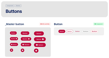
Design system

Design examples


Production
Final Design
Welcome page


Login page

Page with graphic

Dashboard page

Loan amount page

Final page

Post launch Data 📈
-
The new app was launched in September 2025
-
There were significant data has shown so far
Adoption & discovery
4%
Apple installs up
33%
Android installs up
16%
Active user increased
+117%
Gained new users (more than doubled ever before)
Usage Momentum
Engagement remains strong
8%
30-day users increased
22%
1-day users increased
28%
7-day users increased
Engagement & Stickiness
-
As users adapt to the new pages, time on page declined 17%, but daily active users are up 16% and monthly active up 20%.
-
Signalling improving stickiness.
Key takeaways 🚀
-
Communicated every morning or every other day to address questions or check on development progress .
-
Created specifications for developers to follow during development.
-
Ensured primary and secondary colors, font sizes/styles met WCAG 2.0/ AODA standards.
-
Made components available for the team to reference in the new design system.
