NGO & Fair Trade Vancouver
Revolutionizing the Donation Journey
Background
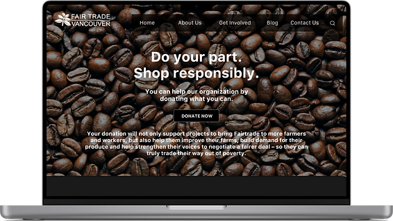
Revamped the website's look and fixed broken links, prioritizing usability, findability, and readability for a seamless donation experience.
Timeline
3 months
Role
End to end product design
Stakeholders
1 project manager, 2 UI designers, 2 UX designers and 2 developers
Tools
Figma, Miro, Invision, Trelo


Discovering Business and User needs
What are your thoughts on using this website?

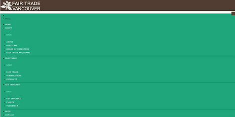

The Challenge
-
How can we streamline the donation process?
-
How can we make the website more accessible?
Goals for tool
Usability
The user needs to be navigated to the donation page accessibly. Aseptically pleased appearance to increase usability.
Business
Fix the code to ensure broken links are fixed. Boost the user engagement throught the page.
User survey's
The Fair Trade Vancouver website is difficult to use due to broken links and unappealingly displayed images
Survey findings
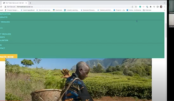
Discovered that 100% of testers found that some pages were not found and led to 404.

"When you hover over the description, somehow it won't be highlighted."
Usability testing
Identify user experience
Goals
Monitoring and documenting the actions and experiences of each person.
Results
100% of participants revealed that they had a terrible experience with this website. They couldn't figure it out what this website was about.
Brainstorms and User Journeys


Gathering thoughts on Affinity Diagram
Goals
Using the test notes, create an affinity diagram. Assisted in the formulation of the most critical usability issues.
Results
It seemed users frequently highlighted design elements on the website, expressing a desire for more graphics to better grasp the website's purpose.
I like, I wish and What if
Goals
Utilizing sticky notes on the current website, I captured user preferences and envisioned an ideal production look based on their desires and needs. This method helped in visualizing and gathering insights for potential improvements.
Results
Enhancing the understanding of fair trade is a top priority, along with improving visual elements and the navigation bar. Addressing broken links on the original website stands out as a critical objective, pivotal in ensuring a smooth user experience.
.jpg)
Main Page

Donate Page

_edited.jpg)
Learn about page
Brand Page
Rough sketches
Goals
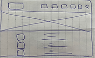
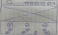
I expedited our team's progress by creating straightforward wireframes, emphasizing rapid development of planned functionality, features, content, and user flows over intricate details.
Results
The drawings underwent a comprehensive review by the developer team, allowing us to address trade-offs and identify issues before advancing to layout testing. This step ensured a more refined and problem-free layout testing phase.
Design Hurdle 1
Donation process
Challenge: How to navigate users to donate?
After conducting usability testing, I wanted to understand how users were motivated to fund.
I collaborated with my team to approach this from the users' perspective, ensuring our solutions aligned with their needs and experiences.
Solution: Create Value Proposition
The design team is striving to create an improved Fair Trade Vancouver website to tackle the issue of users struggling to access information about the NGO and its initiatives. This initiative aligns with our goal to enhance the site's value proposition.
Design exploration
User Research
Type of research
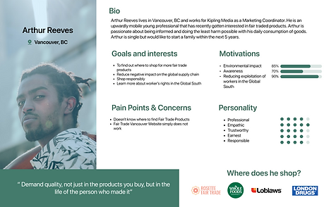
In crafting the proto persona, insights were gleaned from Fair Trade Vancouver's user experiences to define goals and pain points.
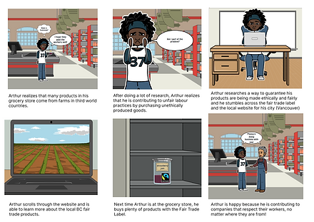
Regarding the storyboard, it narrates Arthur's journey where he extensively researches Fair Trade products via the Fair Trade Vancouver website. His satisfaction arises from contributing to businesses valuing their employees, leading him to purchase more Fair Trade products.
Findings from research
30% of website visitors have a clear objective: donating to the food bank. Understanding these distinct intentions enables us to optimize the website to better serve and facilitate their donation process effectively.
Impact of Research on Product Development
The donation page experienced a notable 20% surge in user engagement, indicating increased interest and participation in the donation process.

"I want to donate the food bank in my local area."
Design Hurdle 2
Intuitive design
Challenge: How to create accessible design?
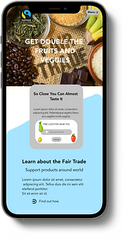
The website redesign focuses on aesthetics, functional links, logical information display, and improved navigation. This aims to boost user engagement and interaction with the organization.
Solution: Define Optimizing Website Functionality
The fragmented top bar with broken links needs immediate fixing.
Consistency in theme colours, typography, and visual imagery across the website is a priority.
Clarity is essential for the search bar and labels.
Ensuring functional buttons placed appropriately is crucial for a seamless user experience.
Design exploration


User Research
Type of research
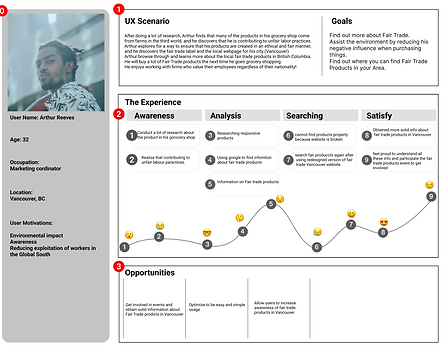
The user journey aims to engage users in events and introduce them to fair trade products. Additionally, the sitemap seeks to optimize the app for straightforward and intuitive usage, ensuring a simple and easy experience for users.
Findings from research
Users have to verify their account in order for them to donate.
Impact of Research on Product Development
We successfully standardized color schemes, fonts, and high-resolution imagery across the platform. Additionally, our focus on improving user flow and navigation has significantly enhanced the Fair Trade Vancouver experience.
Production
Final design


Design System

Results & Next Steps
Initial Results
💡
Donation page increased 20% of user engagement.
💡
Fixed the broken links.
Quotes from colleague
"Much cleaner appearance."
"Easy to donate now."
Final thoughts
Learned promoting awareness and demanding quality not only in the items we consume, but also in the lives of those who make them is central to the Fair Trade concept.


.png)